Photo by Pixabay
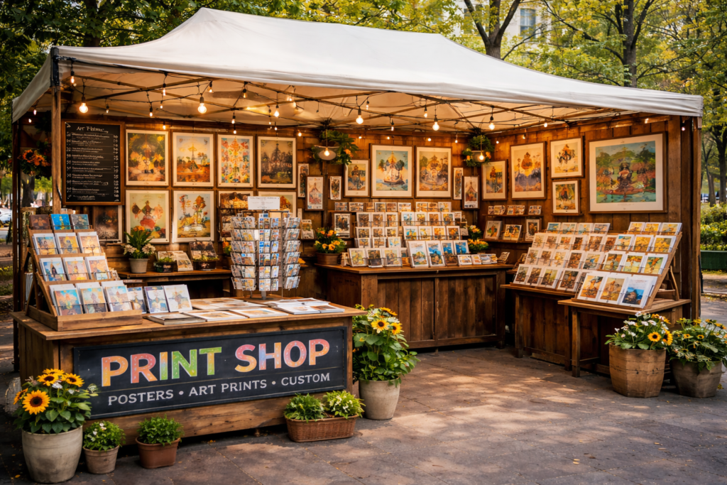
An Instagrammable print booth is no longer a nice-to-have at events. It is a visibility tool that extends reach far beyond the venue walls. When designed intentionally, a booth becomes a content generator, turning attendees into distributors of your brand message.
The goal is not decoration. The goal is shareability. An Instagrammable print booth must photograph well, communicate brand identity clearly, and encourage people to step in front of it without being prompted. If people need to be asked to take photos, the booth is not working hard enough.
The first consideration is visual clarity. Social media compresses detail. Busy designs collapse on camera. Clean layouts, strong contrast, and bold shapes perform better on screens. An Instagrammable print booth should be legible in a thumbnail, not just impressive up close.
Branding must be instantly recognisable. Logos, colours, and visual language should be visible from multiple angles. Subtle branding that works in print may disappear on camera. However, over-branding feels forced. The balance is clear identity without clutter.
Lighting is critical and often overlooked. Poor lighting ruins even the best design. Shadows, glare, and uneven illumination reduce photo quality. An Instagrammable print booth should be evenly lit, with soft, front-facing light that flatters people and reduces harsh contrast.
Matte finishes generally photograph better than gloss. Glossy surfaces reflect lights and create hotspots. Matte materials reduce glare and improve colour accuracy on camera. This makes a significant difference in how the booth appears in photos and videos.
Scale influences impact. Small elements get lost in photos. Oversized graphics, typography, or shapes create stronger visual anchors. An Instagrammable print booth should be designed with distance and framing in mind, not just real-world proportions.
Negative space matters. Crowded booths confuse the camera. Space allows people to stand, pose, and frame shots easily. An Instagrammable print booth invites interaction by leaving room for people to become part of the visual.
Backgrounds should be intentional. Plain walls do not encourage sharing. However, overly detailed backdrops distract from faces. Patterns, textures, or simple gradients aligned with brand colours perform well. The background should support the subject, not compete with it.
Consistency across elements strengthens recognition. Backdrops, counters, banners, and props should feel related. Mismatched elements weaken visual impact. An Instagrammable print booth works as a system, not a collection of parts.
Props can increase engagement when used selectively. Signs, frames, or physical elements that invite interaction encourage participation. Props should be sturdy, on-brand, and easy to hold. An Instagrammable print booth should never rely on gimmicks that date quickly.
Text should be minimal. Long messages are not read in photos. Short phrases, hashtags, or icons work better. Any text included should be readable at arm’s length and from a distance.
Hashtags and handles should be visible but secondary. They should not dominate the design, but they should be easy to spot when someone looks closely at the photo. An Instagrammable print booth supports sharing without demanding it.
Material choice affects perception. Fabric backdrops reduce glare and photograph softly. Rigid panels provide structure and clean edges. The choice should align with brand tone and transport needs.
Portability matters. Booths that are difficult to assemble or transport often get compromised setups. An Instagrammable print booth must be practical to deploy consistently, or quality drops over time.
Designing an Instagrammable Print Booth That Performs
Creating an Instagrammable print booth starts with intent.
Define what you want people to photograph. The brand, the product, themselves, or an experience. Design should support that outcome.
Design for the camera, not just the eye. Test layouts through a phone camera early. Adjust based on how elements appear on screen.
Prioritise lighting early. If the venue lighting is unreliable, build lighting into the booth design.
Use brand colours confidently. Colour consistency improves recognition across shared images.
Limit visual noise. Fewer elements improve clarity and shareability.
Plan angles. People will not always shoot straight on. Ensure branding is visible from common angles.
Leave room for people. A booth is not a billboard. It is a stage.
Choose finishes that reduce glare and improve texture on camera.
Avoid trend-driven elements that will date quickly.
Standardise the booth design so it can be reused across events without losing impact.
Work with experienced print and branding partners who understand how materials, scale, and lighting affect photography. Collaboration with Kawaii Labs Corporate supports the creation of Instagrammable print booths that balance visual impact, brand consistency, and practical deployment.
Ultimately, an Instagrammable print booth is not about chasing social media trends.
It is about making your brand easy to share.
When a booth photographs well, feels inviting, and communicates clearly, people do the marketing for you—naturally, voluntarily, and repeatedly.
That organic reach is what turns a print booth into a digital amplifier.

