Photo by Anastasia Zhenina
Effective logo design is not about trends, decoration, or personal taste. A logo works when it performs consistently across environments, scales without loss of clarity, and reinforces brand recognition over time. Many logos look good in isolation but fail once they leave the screen. A truly effective logo is tested by use, not by presentation.
The primary role of a logo is identification. It should allow people to recognise the brand quickly and reliably. This sounds simple, but it is where many logos fail. Overly complex designs, excessive detail, or clever concepts that require explanation slow recognition. Effective logo design prioritises instant clarity.
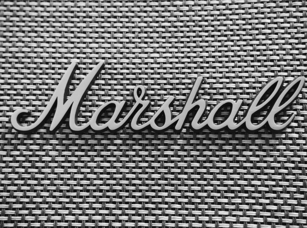
Simplicity is a functional requirement, not an aesthetic preference. Simple logos reproduce more reliably across print, packaging, signage, digital platforms, and merchandise. They remain legible at small sizes and recognisable at a distance. Effective logo design removes anything that does not contribute to recognition.
Memorability is closely linked to simplicity. A logo does not need to be unique in concept to be memorable. It needs to be distinctive enough within its category and used consistently. Effective logo design becomes memorable through repetition, not novelty.
Versatility is critical. Logos must work in colour and in black and white. They must function on light and dark backgrounds. They must hold up on paper, fabric, vinyl, metal, and screens. Effective logo design anticipates these realities from the start.
Scalability often exposes weak logos. Fine lines disappear at small sizes. Tight spacing fills in when printed. Intricate icons blur when enlarged. Effective logo design is built to scale up and down without losing integrity.
Typography plays a major role. Letterforms communicate tone before words are read. The wrong type choice can undermine brand positioning instantly. Effective logo design aligns typography with brand personality while maintaining readability and balance.
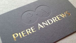
Colour choice supports recognition, but colour alone should not carry the logo. A logo that only works in colour is fragile. Effective logo design remains identifiable even when colour is removed, restricted, or altered by production limitations.
Timelessness matters more than trend alignment. Trend-driven logos age quickly and require frequent redesigns. Each redesign resets recognition. Effective logo design avoids visual fads and focuses on longevity.
Context should guide design decisions. A logo for a legal firm serves a different role than one for a creative studio or retail brand. Effective logo design reflects the environment in which the brand operates without relying on clichés.
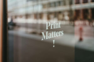
Print exposes flaws faster than digital. Screens are forgiving. Print is not. Colour shifts, resolution limits, and material behaviour all affect appearance. Effective logo design is tested in print early, not adapted later.
Negative space and balance influence perception subconsciously. Crowded logos feel chaotic. Balanced logos feel confident. Effective logo design uses space intentionally to support clarity.
Symbolism should be restrained. Logos do not need to explain what a company does. They need to identify it. Overloaded symbolism confuses rather than clarifies. Effective logo design allows meaning to build through association over time.
Reproducibility affects cost and consistency. Logos that require special treatments to look acceptable increase production complexity. Effective logo design reduces friction by working within standard production constraints.
Consistency is where logos truly succeed. Even a strong logo fails if used inconsistently. Effective logo design includes clear usage rules that protect spacing, proportion, and placement.
The Practical Tests of an Effective Logo
A logo that truly works passes real-world tests.
It is recognisable at a glance.
It remains legible at small sizes.
It works in black and white.
It reproduces accurately across materials.
It aligns with brand positioning.
It does not rely on trends to feel relevant.
It scales across applications without redesign.
It supports consistency rather than demanding exceptions.
If a logo fails any of these tests, it will create friction over time.
Logo Designs That Work Long-Term
Effective logo design starts with strategy, not sketching.
Begin by defining brand positioning clearly. Who the brand is for, what it stands for, and how it wants to be perceived guide design decisions logically.
Choose simplicity deliberately. Remove elements that do not contribute to recognition.
Test early and often. Apply the logo to business cards, signage, packaging, uniforms, and digital mockups. Problems appear quickly when logos are used in context.
Limit colour reliance. Ensure the logo works without colour.
Avoid decorative complexity. Clever ideas that require explanation do not scale.
Document usage rules clearly. Protect the logo from misuse through clear guidelines.
Resist frequent changes. Recognition is built through repetition.
Work with production realities in mind. Design choices should respect how logos are actually printed and applied.
Collaborating with experienced branding and print partners improves outcomes significantly. Translating a logo from concept to consistent real-world use requires practical insight. Working with Kawaii Labs Corporate supports effective logo design by aligning brand strategy, design clarity, and production consistency across print, packaging, and merchandise.
Ultimately, a logo truly works when it disappears into the brand.
It does not need explanation.
It does not demand attention.
It simply shows up, again and again, recognisably and reliably.
That quiet consistency is what turns a logo from a graphic into a brand asset.
