Photo by Kawaii Labs
Shared office buildings bring together multiple businesses under one roof, each with its own brand, visitors, and operational needs. Without a clear signage strategy, these environments become confusing, frustrating, and unprofessional. Shared office signage is not just about labels on doors. It is about creating order, neutrality, and clarity without favouring one tenant over another.
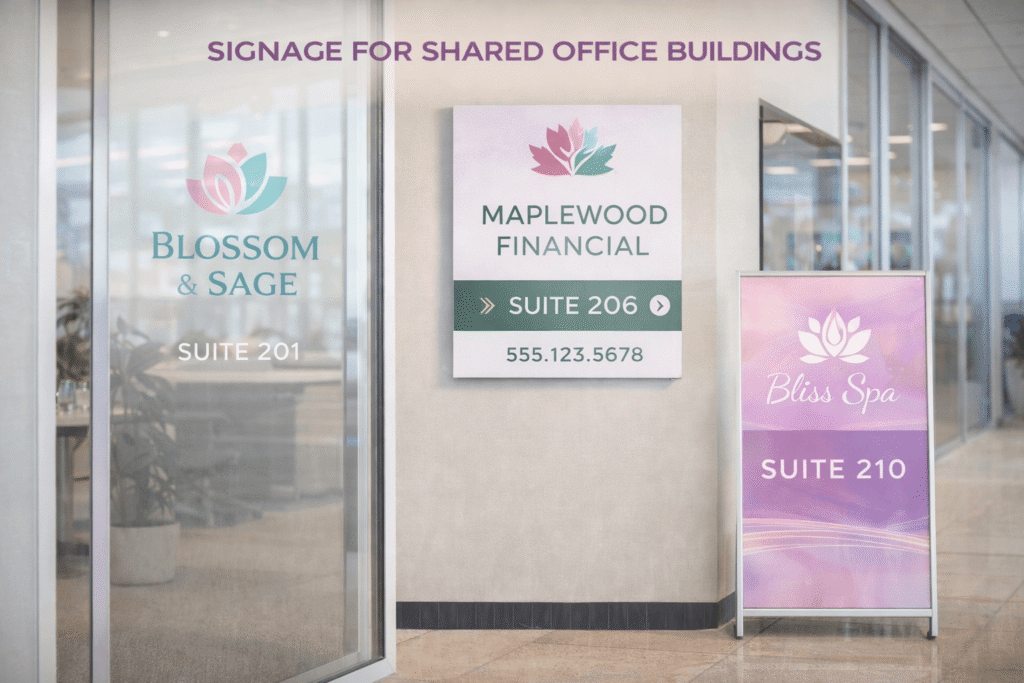
Why Shared Office Buildings Need Thoughtful Signage
The first challenge in shared spaces is balance. No single brand should dominate communal areas unless explicitly agreed. Signage must serve the building as a whole before serving individual occupants. This requires a system-led approach rather than ad hoc decisions made by tenants independently.
Wayfinding is the foundation of effective shared office signage. Visitors should be able to enter the building and immediately understand where they are and where they need to go. Reception directories, floor listings, and directional signs reduce reliance on staff and prevent bottlenecks. Clear navigation improves the experience for everyone in the building.
Consistency is critical. Fonts, colours, sizes, and placement rules should be standardised across shared areas. When each tenant installs signage independently, visual clutter follows. A consistent system signals professionalism and reduces confusion. Shared office signage should feel intentional, not negotiated.
Hierarchy helps manage complexity. Building-level signage should come first, followed by floor-level information, then tenant identification. Mixing these levels creates confusion. A visitor looking for a floor directory should not be distracted by promotional messaging. Shared office signage works best when information is layered logically.
Neutral design choices support fairness. Shared signage systems typically use restrained colour palettes and simple typography. This avoids favouring any single brand aesthetic. Individual branding should be confined to private spaces or approved zones. Shared office signage should communicate function before identity.
Reception areas require special attention. This is often the first point of contact for visitors. A clear directory showing tenant names, floor numbers, and suite numbers reduces uncertainty. Digital directories can be useful, but printed signage provides reliability and immediate clarity without technical dependency.
Floor directories and lift lobbies are high-impact zones. Visitors often pause here to orient themselves. Signage in these areas should be clear, well-lit, and uncluttered. Updates should be easy to manage, as tenant changes are common. Modular shared office signage systems simplify updates without full replacements.
Door signage should follow a consistent format. Tenant names, suite numbers, and operating hours should be presented uniformly. Allowing each tenant to customise door signage in shared corridors quickly erodes cohesion. Shared office signage should establish clear rules for door identification.
Compliance signage must be prioritised. Fire exits, safety instructions, accessibility markers, and emergency information must be clearly visible and compliant with regulations. These signs should not be obscured by branding or decorative elements. In shared environments, safety signage takes precedence over all other considerations.
Accessibility is a non-negotiable requirement. Signage should consider readability, contrast, placement height, and tactile requirements where applicable. Shared office signage must support all users, including visitors unfamiliar with the building layout or those with mobility or visual impairments.
Material choice influences longevity and maintenance. Shared areas experience high foot traffic. Flimsy materials degrade quickly and create a neglected appearance. Durable substrates, protective finishes, and secure mounting extend lifespan and reduce replacement frequency. Shared office signage should be built for daily use.
Lighting plays a supporting role. Poorly lit signage undermines even the best design. Directories and directional signs should be positioned in well-lit areas or supported with dedicated lighting. Visibility should be consistent throughout the day. Shared office signage must remain readable under varying lighting conditions.
Change management is an ongoing reality. Tenants move, names change, and layouts evolve. A signage system that cannot adapt becomes obsolete quickly. Modular panels, interchangeable name strips, or insert-based systems allow updates without redesign. Shared office signage should assume change, not resist it.
Governance matters. Clear guidelines should define who controls shared signage, how changes are approved, and who bears costs. Without governance, signage becomes fragmented. Building management should own the shared office signage framework to maintain consistency and fairness.
Private branding still has a place. Within individual suites, tenants should be free to express their brand identity. The transition from shared to private space should be clear. This contrast reinforces order and reduces visual conflict. Shared office signage sets the stage; private branding delivers identity.
Visitor flow should inform placement. Signs should appear at decision points, not after confusion occurs. Corridors, intersections, and lift exits are key locations. Over-signing creates clutter, while under-signing creates frustration. Shared office signage should guide without overwhelming.
Temporary signage should be controlled. Event signs, notices, or temporary directions should follow the same visual language or be limited in duration. Uncontrolled temporary signs quickly undermine the system. Shared office signage must remain disciplined to retain credibility.
Cultural tone matters. Overly corporate signage can feel cold in creative or flexible workspaces. Conversely, overly casual signage may feel unprofessional in corporate buildings. The tone of shared office signage should reflect the building’s positioning while remaining neutral.
Maintenance should be planned. Damaged, outdated, or crooked signs erode trust. Regular audits ensure signage remains accurate and presentable. Shared office signage is only effective if it is maintained consistently.
Digital and print signage should complement each other. Digital screens offer flexibility, but printed signage provides reliability. In shared buildings, a hybrid approach often works best. Shared office signage should not rely solely on technology for critical information.
Sustainability considerations are increasingly relevant. Choosing durable materials and limiting unnecessary reprints reduces waste. Modular systems also support responsible practices. Shared office signage should align with broader sustainability goals where possible.
Working with experienced print and branding partners improves outcomes significantly. Strategic guidance helps align wayfinding logic, material choice, and production quality. Collaboration with Kawaii Labs Corporate supports this process by translating shared office requirements into clear, durable, and well-managed signage systems.
Planning signage for shared office buildings is ultimately about respect. Respect for tenants, visitors, and the building itself. Clear signage reduces friction, saves time, and improves perception.
When shared office signage is planned as a system rather than a series of individual signs, the environment becomes easier to navigate and more professional. In multi-tenant spaces, clarity is the strongest signal of competence.
Good shared signage does not draw attention to itself. It simply works.


