Photo by Bent Van Aeken
Maintaining consistent print colours is essential for any brand. Inconsistent print colour output across different print jobs can damage your brand’s visual integrity and reduce trust with customers. Whether you’re printing business cards, banners, packaging, or uniforms, your brand print colours must look the same every time.
In this guide, we’ll cover why print colour consistency matters, what causes colour variation, and how you can control the outcome across every print run. If you’re working with Kawaii Labs Corporate, we help you set up a reliable system that keeps your colours sharp, uniform, and on-brand.
Why Print Colour Consistency Is Non-Negotiable
Your brand’s colour palette is part of its identity. Imagine Coca-Cola red appearing as burgundy on one flyer and tomato on another. That inconsistency sends the wrong message. In marketing and product design, colour is not just aesthetic—it’s functional and psychological.
When colours vary between jobs, it can:
- Undermine brand recognition
- Create confusion in your product line
- Lead to reprints and wasted costs
- Frustrate customers or retailers
Investing in colour consistency saves time, maintains professionalism, and reinforces your brand’s reliability.
Common Causes of Print Colour Inconsistency
Even slight changes in colour output can result from a wide range of issues, including:
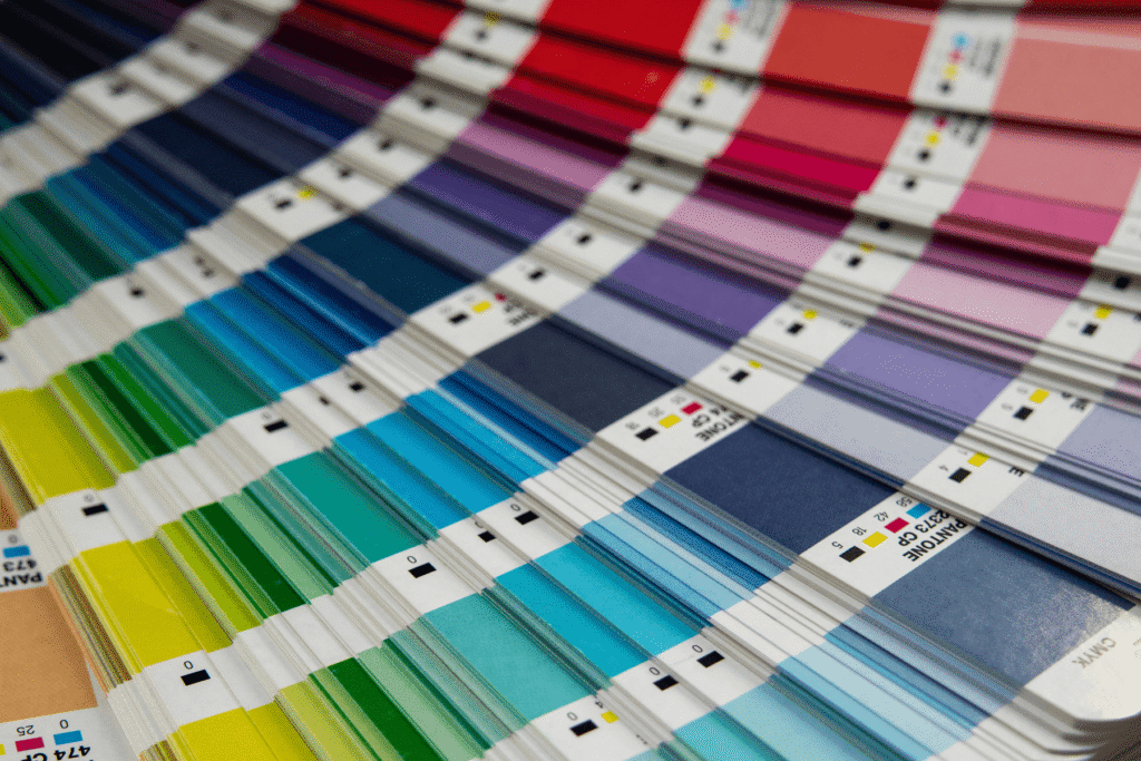
1. Different Colour Systems
- CMYK (Cyan, Magenta, Yellow, Black) is used in most print processes.
- RGB (Red, Green, Blue) is used for screens and digital design.
- Pantone (PMS) offers standardised colour matching, often used in logo and packaging work.
If you design in RGB and print in CMYK without proper conversion, colours may appear muted or shifted.
2. Printer Calibration Differences
Each printer or print shop may use different machines, inks, and profiles. If the printers aren’t properly calibrated, the same file can yield different results.
3. Ink and Substrate Variations
The type and brand of ink and the surface it’s printed on (e.g., coated paper vs uncoated board vs polyester fabric) affect how colours appear. Glossy surfaces reflect light differently than matt finishes.
4. Environmental Factors
Humidity, temperature, and even air quality in the print room can influence drying times and ink absorption, especially in offset and screen printing.
Best Practices to Maintain Print Colour Consistency
Consistency begins at the design stage and carries through to production. Here’s how to tighten your colour control process:
1. Design Using CMYK or Pantone
Always design in CMYK if you’re printing digitally. If exact colour accuracy is critical (e.g., logos), use Pantone references to eliminate interpretation between devices.
2. Use Colour Profiles
Assign ICC colour profiles to your files. These digital instructions help printers interpret how colours should look across devices and materials.
3. Embed Colours in Print Files
Before sending your artwork to print, embed all colour profiles directly into the file (usually PDFs or AI files). This reduces the risk of automatic conversions that may alter your colours.
4. Request a Print Proof
Always ask for a digital or physical proof. A hard-copy proof is ideal when colour accuracy is crucial. Compare it to your brand standards before approving full production.
5. Work With One Print Partner
Using a single provider like Kawaii Labs Corporate allows you to standardise materials and printing processes. We keep a record of your colour references, past jobs, and output results to ensure consistent reproduction.
6. Maintain Colour Reference Documents
Create a brand colour specification sheet including:
- Pantone codes
- CMYK breakdown
- RGB equivalents
- Hex codes for digital
- Substrate-specific notes (e.g., “On kraft paper, use Pantone 1795C for red.”)
Share this with every designer and printer you work with.
How Kawaii Labs Corporate Ensures Consistency
We follow strict colour management protocols for all client files. That includes:
- Reviewing and converting artwork to the correct print colour space
- Offering Pantone-matching for critical branding pieces
- Keeping internal records of your approved colour proofs
- Calibrating our machines for repeatability across print runs
With us, your brand will never suffer from “close enough” colours.
Final Tip: Monitor Consistency Over Time
Over long campaigns or seasonal reprints, revisit your proofs and colour samples. Regularly check output against your standards and flag any variations early.
Consistency isn’t about perfection—it’s about control. With the right setup and print partner, you can maintain strong, vibrant, and reliable colours across every order.
Trust Kawaii Labs Corporate to make sure your colours always show up exactly how they should—on brand, on time, and on point.


