Photo by Kawaii Labs
PVC banners remain one of the most versatile signage formats because they balance durability, print quality, and cost. However, many PVC banners fail to perform because design decisions ignore real-world viewing conditions. High-impact results come from designing for distance, movement, and environment, not from adding more detail. These PVC banner design tips focus on performance, not decoration.
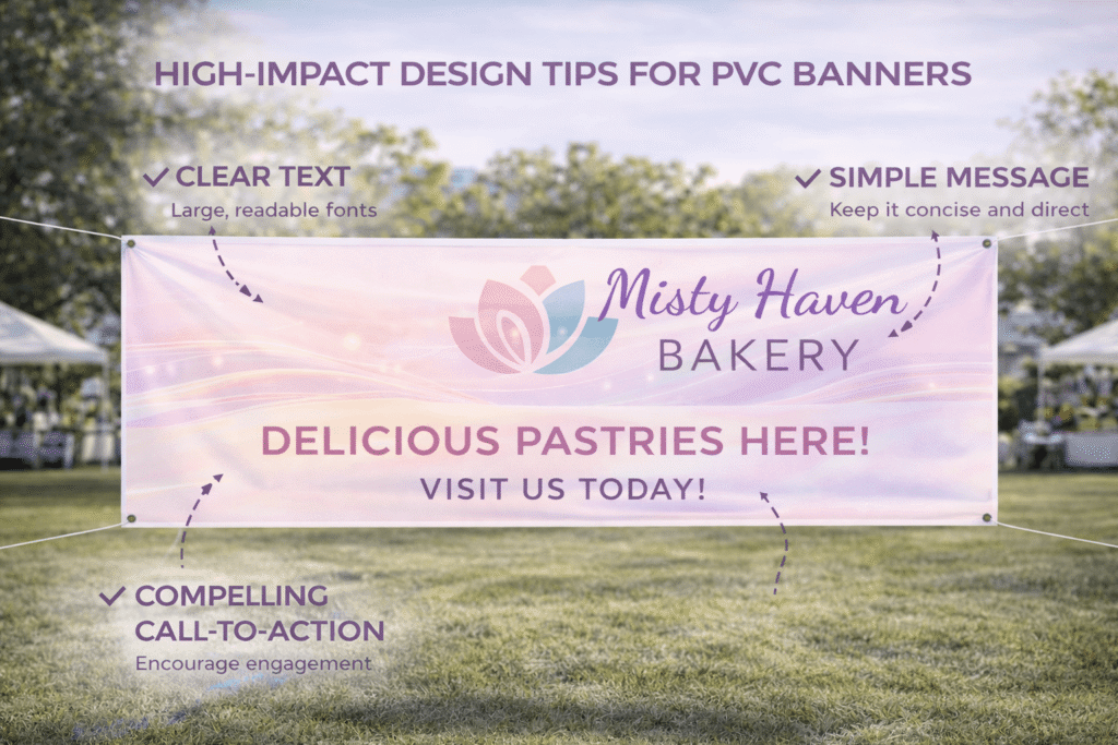
Start with a single objective. A banner should do one job well. Whether that job is brand recognition, direction, or promotion, clarity beats complexity every time. When a banner tries to communicate multiple messages, none of them land. Define the primary action you want the viewer to take and design everything around that.
Hierarchy is non-negotiable. Viewers scan banners quickly, often while moving. The most important element should be instantly recognisable. Typically, this is the brand name or headline. Secondary information should support, not compete. Tertiary details are often unnecessary on banners altogether.
Typography choices determine legibility at distance. Sans-serif fonts with consistent stroke weights perform best on PVC banners. Decorative fonts may look appealing on screen but break down at scale. Letter spacing should be generous. Tight tracking reduces readability, especially in outdoor light.
Effective Design Strategies for Your PVC Banner
Text size should be determined by viewing distance, not preference. A common mistake is using text that reads well at arm’s length but fails from five or ten metres away. Headlines should be large enough to read at first glance. Supporting text should only be included if it remains legible from the intended distance.
Contrast does more work than colour quantity. High contrast between text and background improves readability under varied lighting. Light text on dark backgrounds or dark text on light backgrounds performs best. Low-contrast combinations fail even with perfect printing. PVC banner design tips always prioritise contrast over colour complexity.
Colour restraint improves impact. Using too many colours creates visual noise, especially outdoors. A limited palette aligned to brand colours strengthens recognition. Bright accent colours should be used sparingly to guide attention rather than dominate the design.
Imagery must be bold and simple. Fine detail disappears at distance and during movement. If using photos, choose high-resolution images with clear subjects and strong contrast. Avoid busy backgrounds. PVC banners benefit from imagery that reads instantly, not images that require inspection.
Negative space is a strategic tool. Empty space around key elements improves focus and readability. Overfilling a banner reduces clarity. PVC banner design tips consistently emphasise breathing room because it allows the message to stand out in crowded environments.
Orientation should match placement. Vertical banners suit walkways and entrances. Horizontal banners suit fences and stages. Designing against the intended orientation creates awkward layouts and compromises readability. The physical environment should guide layout decisions from the start.
Material behaviour should influence design. PVC banners are durable but can reflect light depending on finish. Glossy surfaces increase vibrancy but also glare. Matte finishes reduce reflection and improve readability under spotlights or sun. Design contrast should account for finish choice.
Wind and movement affect perception. Banners rarely sit perfectly still outdoors. Designs with thin lines or small text suffer when the banner moves. Larger type and solid shapes maintain clarity even when the banner shifts.
Edge finishing affects both durability and appearance. Designs should include safe zones to avoid text or logos being obscured by hems, eyelets, or pole pockets. Ignoring finishing requirements often results in cropped or distorted content.
Placement of logos deserves restraint. Oversized logos may dominate but often reduce professionalism. The logo should be clearly visible without overpowering the message. Consistent placement across banners builds recognition more effectively than sheer size.
Call-to-action discipline matters. If a call to action is included, it should be short and direct. Complex instructions do not work on banners. In many cases, brand recognition is the primary goal, with action occurring later through other channels.
Lighting conditions should be assumed to be imperfect. Banners may be viewed in direct sun, shade, or artificial light. Designs should be tested for readability under high brightness and low contrast conditions. PVC banner design tips always plan for worst-case scenarios.
Scale testing is essential. Designs that look balanced on a screen often fail at full size. Reviewing artwork at actual dimensions reveals spacing, hierarchy, and legibility issues early. This step prevents costly reprints.
Consistency across banners strengthens impact. When multiple PVC banners are used together, they should follow the same visual logic. Consistent typography, colour use, and layout improve recognition and professionalism.
Durability messaging should match banner lifespan. Temporary promotions can tolerate simpler designs. Long-term banners benefit from timeless design choices that do not date quickly. PVC banner design tips favour longevity for banners intended for repeated use.
Environmental context influences effectiveness. A banner placed against a busy background needs stronger contrast. A banner placed against a plain wall can be more subtle. Designing in isolation leads to missed opportunities.
Budget efficiency improves with smart design. Clear, simple designs often print more consistently and reduce colour and finishing costs. Overdesign increases risk without improving performance. High impact does not require complexity.
Accessibility should not be ignored. Adequate contrast and clear typography support readability for all viewers. This improves overall effectiveness rather than limiting design.
Testing banners in situ provides valuable insight. Observing how people approach, glance, or ignore the banner informs future improvements. PVC banner design tips evolve through real-world feedback, not assumptions.
Working with experienced print partners improves outcomes significantly. Strategic guidance helps align design, material choice, finishing, and placement. Collaboration with Kawaii Labs Corporate supports this process by translating design intent into durable, high-impact PVC banner execution.
Ultimately, high-impact PVC banners succeed because they respect how people actually see. They communicate quickly, clearly, and confidently without demanding attention.
Designing for PVC banners is about discipline. When hierarchy is clear, contrast is strong, and content is focused, banners perform under pressure. In busy environments, clarity wins every time.
High-impact design does not shout. It speaks clearly at a distance, in motion, and under imperfect conditions. PVC banner design tips that prioritise readability and restraint ensure banners deliver value long after they are printed.


