Photo by Jon Tyson
Large-scale banners are not simply small banner design made bigger. Banners are viewed from distance, often at speed, and usually in visually busy environments. This changes how information is processed. What works on a flyer or screen often fails when scaled up. Designing banners that truly pop requires understanding how people see, move, and decide in real-world spaces.
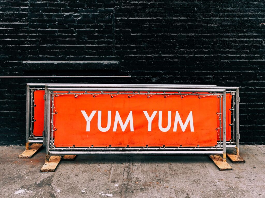
The primary function of a banner is instant communication. You typically have seconds to be noticed and understood. This makes restraint more powerful than detail. Large-scale banner design succeeds when it reduces effort for the viewer rather than demanding attention.
Why Banner Design Basics Matter for Large-Scale Prints
The first principle is hierarchy. A banner should communicate one main message. Secondary information supports that message but never competes with it. When everything is emphasised, nothing is. Large-scale banners works best when the eye knows exactly where to land first.
Text size is critical. Legibility matters more than style. Fonts must be readable from the intended viewing distance. Thin fonts, decorative scripts, or condensed typefaces lose clarity when viewed quickly or from far away. Large-scale banner design prioritises bold, open letterforms that hold their shape at scale.
Contrast drives visibility. High contrast between text and background improves readability across lighting conditions. Subtle colour differences may look refined up close but disappear at distance. Large-scale banner design often requires stronger contrast than digital or small-format print.
Colour choice should consider environment. Outdoor banners compete with sky, buildings, and natural light. Indoor banners compete with signage, lighting, and crowds. Colours should be tested against real backgrounds rather than assumed. Large-scale design is context-dependent, not theoretical.
Image selection must account for scale. Low-resolution images that look acceptable on screen will pixelate when enlarged. Only high-resolution images designed for large-format output should be used. Large-scale banner design exposes image flaws immediately.
Cropping is as important as resolution. Images should have clear focal points that remain recognisable at distance. Busy scenes lose impact when enlarged. Simple, bold imagery performs better in large-scale banner design.
Whitespace is often underestimated. Empty space improves comprehension by separating elements. Crowded banners overwhelm viewers and reduce message retention. Large-scale banner design benefits from breathing room even when space feels abundant.
Message length should be minimal. People do not read paragraphs on banners. Headlines, short phrases, or calls to action work best. Large-scale banner design focuses on recognition rather than explanation.
Branding must be visible but not dominant. Logos should be clear and well-placed without overpowering the message. Over-branding can reduce clarity and feel aggressive. Large-scale banner design balances brand presence with communication.
Material choice influences perception and performance. Vinyl, fabric, mesh, and PVC all behave differently. Fabric reduces glare. Vinyl offers durability. Mesh suits windy environments. Large-scale banner design must align material choice with usage conditions.
Lighting affects everything. Glossy materials reflect light and reduce readability under spotlights or sunlight. Matte finishes reduce glare and improve clarity. Large-scale banner design should anticipate lighting rather than react to it.
Viewing angle matters. Banners are rarely seen straight-on. Distortion occurs when viewed from the side or below. Large-scale banner design compensates with larger text and simplified layouts.
Distance determines detail. If a banner is meant to be seen from across a hall or street, fine details are wasted. Large-scale banner design should be evaluated from the farthest realistic viewing point, not up close.
Consistency across banners strengthens impact. A single banner can attract attention, but a coordinated set reinforces recognition. Large-scale banner design works best as a system rather than isolated pieces.
Installation constraints must be considered early. Grommets, poles, frames, and tension systems affect layout. Important elements should never sit near edges where they may be obscured. Large-scale banner design includes practical planning.
Durability affects long-term perception. Faded or damaged banners undermine credibility. Choosing appropriate materials and finishes protects brand image over time. Large-scale banner design should consider lifespan, not just launch impact.
Designing Large-Scale Prints That Truly Pop
Effective large-scale banner design starts with clarity.
Define the single most important message. Everything else supports it or gets removed.
Design for distance first, not close-up inspection.
Choose fonts for legibility, not personality.
Use high contrast deliberately.
Limit text aggressively.
Select images built for enlargement.
Test designs at actual size whenever possible.
Consider environment, lighting, and movement.
Align material choice with usage conditions.
Plan installation before finalising layout.
Avoid trend-driven design that sacrifices clarity.
Maintain brand consistency without clutter.
Work with experienced print partners who understand scale, materials, and real-world conditions. Collaboration with Kawaii Labs Corporate supports large-scale banner design by aligning visual clarity, material performance, and production accuracy for banners that perform as intended.
Ultimately, banners do not compete through complexity.
They win through immediacy.
Large-scale banner design that pops does not shout. It communicates clearly, confidently, and instantly.
When banners are designed with how people actually see and move in mind, they stop being background noise and start doing their job—drawing attention, delivering the message, and reinforcing the brand in seconds.


