Photo by Kawaii Labs
In e-commerce, packaging does more than protect products. It becomes a silent brand communicator that operates before, during, and after unboxing. Colour choices play a decisive role in how that communication is received. E-commerce packaging colour psychology influences trust, perceived value, emotional response, and brand recall, often without the customer consciously realising it.
Unlike retail environments, where packaging competes on shelves, e-commerce packaging is experienced in isolation. This changes how colour functions. There is no neighbouring product to contrast against. Instead, colour works directly on the customer’s expectations and emotions. This makes colour decisions more influential, not less.
The first interaction with packaging often happens through anticipation. Customers see tracking updates, delivery notifications, and finally a parcel arriving at their door. When the box appears, colour immediately sets a tone. Neutral or natural colours suggest efficiency and responsibility. Bold colours create excitement and personality. Poorly chosen colours can create confusion or reduce perceived value before the product is even opened.
Trust is one of the most important emotional drivers in e-commerce psychology. Customers cannot touch the product before purchase, so they rely on cues. Packaging colour is one of those cues. Clean, consistent colour use signals organisation and reliability. Inconsistent or clashing colours create doubt, even when the product quality is high.
Neutral colours such as kraft brown, white, and muted greys are widely used in e-commerce packaging for a reason. They communicate practicality, restraint, and professionalism. These colours allow brands to feel established and dependable. They also photograph well and align with sustainability expectations, which increasingly influence perception.
However, neutral does not mean generic. When used intentionally, neutral packaging creates a calm base that allows other brand elements to stand out. Logos, inserts, or interior details become more noticeable against restrained backgrounds. This contrast supports clarity rather than noise.
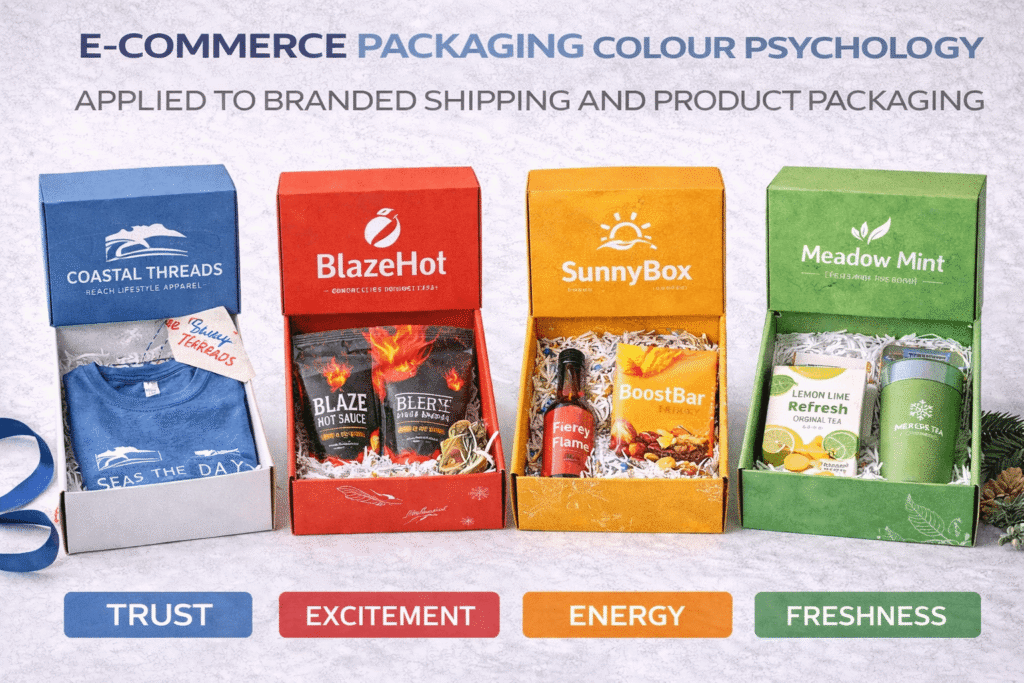
Bold colours operate differently. Deep blues often communicate trust and competence. Greens suggest balance, sustainability, and calm. Blacks and dark tones imply premium positioning and confidence. Warm colours such as reds and oranges introduce energy and urgency but must be used carefully in packaging contexts to avoid feeling aggressive or disposable.
E-commerce packaging colour psychology works best when colour aligns with brand promise. A premium product delivered in overly playful colours creates cognitive dissonance. A youthful, expressive brand delivered in overly muted packaging feels disconnected. Alignment between brand identity and packaging colour reinforces authenticity.
Interior packaging colour is just as important as exterior colour. Many brands keep exteriors neutral for logistics and cost reasons, then introduce colour inside the box. This creates a moment of surprise without compromising shipping practicality. Interior colour can heighten emotional impact while maintaining a controlled external appearance.
Consistency across shipments builds recognition. Customers begin to associate certain colours with the brand before opening the box. This recognition creates familiarity and anticipation, especially for repeat customers. In e-commerce, where repeat business is critical, colour consistency reinforces loyalty.
Colour also affects perceived value. Well-balanced palettes feel deliberate and considered. Random or overly complex colour schemes feel inexpensive. E-commerce packaging colour psychology shows that simplicity often increases perceived quality, especially when combined with good material choices.
Lighting conditions should be considered. Packaging is often viewed indoors, under artificial light. Colours that rely on subtle contrast may disappear. High-contrast palettes maintain clarity in varied lighting environments. This is especially important for branding elements such as logos or messaging printed directly on boxes.
Cultural context matters as well. Colour associations vary across regions and audiences. While global e-commerce brands must consider this carefully, even local brands benefit from understanding how their audience interprets colour. Assumptions based on personal preference often lead to misalignment.
How Colour Psychology Shapes the Unboxing Experience
Sustainability perceptions are strongly influenced by colour. Natural tones and minimal ink coverage suggest environmental awareness, even before materials are assessed. While colour alone does not make packaging sustainable, it contributes to the narrative customers construct. E-commerce packaging colour psychology intersects directly with sustainability messaging.
Cost efficiency is another factor. Limiting colour usage reduces print costs and improves consistency at scale. Many successful e-commerce brands use one primary colour supported by neutral tones. This approach balances recognition with efficiency and scalability.
Colour should never be used to compensate for weak structure or poor materials. Packaging colour amplifies what is already there. High-quality materials paired with thoughtful colour choices feel intentional. Low-quality materials paired with bold colour often feel like compensation rather than confidence.
Testing is essential. Colour that looks correct on screen may behave differently on corrugated board or mailers. Ink absorption, substrate tone, and finish all affect final appearance. Sampling under real conditions prevents costly mistakes and misalignment.
Colour decisions should also consider how packaging appears in shared spaces. Deliveries pass through offices, homes, and public areas. Packaging becomes a semi-public brand display. E-commerce packaging colour psychology extends beyond the recipient to anyone who sees the parcel.
Operational alignment matters. Packaging colours should remain consistent across suppliers and print runs. Variations undermine recognition and professionalism. Clear colour specifications and controlled production processes protect consistency.
Planning ahead strengthens results. Colour systems should be defined as part of broader brand guidelines rather than decided per campaign. This consistency reduces decision fatigue and protects long-term identity.
Working with experienced print and packaging partners improves outcomes significantly. Strategic guidance ensures that colour psychology choices translate accurately across materials and scales. Collaboration with Kawaii Labs Corporate supports this process by aligning brand psychology, print realities, and scalable production.
Ultimately, colour psychology in e-commerce packaging is not decoration. It is communication. It sets expectations, builds trust, and shapes emotional response in a moment when customers are most attentive.
In digital commerce, physical touchpoints carry disproportionate weight. Packaging becomes the brand in that moment. When colour choices are intentional, consistent, and aligned with brand values, e-commerce packaging does more than deliver products. It delivers confidence, recognition, and connection.

