Photo by Bowring Print
Premium print finishes are not decorative extras. They are strategic tools that influence perception, attention, and perceived value. When used correctly, finishes such as foil stamping, embossing, debossing, and specialty coatings elevate printed materials beyond basic communication and turn them into brand signals.
The purpose of premium print finishes is not to impress for the sake of it. Their value lies in contrast. In a world dominated by flat screens and disposable print, tactile finishes interrupt expectation. They slow interaction and invite touch. This moment of pause is where perception shifts.
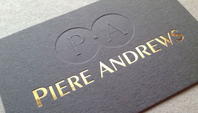
Foil stamping is one of the most recognisable premium print finishes. It uses heat and pressure to apply metallic or pigmented foil to the surface of a printed piece. Unlike ink, foil reflects light. This makes it highly visible even with minimal coverage. Foil is often associated with luxury, confidence, and authority because it requires restraint to use well.
Embossing and debossing introduce physical dimension. Embossing raises elements above the surface. Debossing presses them inward. Both rely on light and shadow rather than colour to create impact. These finishes feel deliberate and timeless, which is why they are commonly used for logos, monograms, and key brand elements.
What makes embossing effective is subtlety. Over-embossed designs feel heavy and distracting. Controlled depth enhances tactility without compromising readability. Premium print finishes work best when they enhance structure rather than overwhelm it.
Spot UV is another widely used premium print finish. It applies a high-gloss coating to specific areas, creating contrast against matte surfaces. This finish draws attention through reflection and texture rather than colour. Spot UV is particularly effective for highlighting logos, patterns, or headings without adding visual clutter.
Soft-touch lamination changes how print feels in the hand. The matte, velvety texture signals refinement and care. This finish reduces glare and invites handling, which increases engagement time. Premium print finishes that affect touch often have a stronger psychological impact than those that rely purely on appearance.
Die-cutting adds structural interest. Custom shapes, windows, or cut-outs create curiosity and reveal content gradually. When used sparingly, die-cutting supports storytelling and interaction. Overuse, however, increases cost without proportional return. Premium print finishes should always support purpose.
Specialty inks, such as metallic inks, white ink, or raised inks, expand creative options. These finishes allow brands to add depth or contrast without additional colours. Raised ink, in particular, creates tactile emphasis similar to embossing but with more flexibility.
The psychology behind premium print finishes is rooted in effort perception. Finishes that require additional production steps signal investment. Recipients subconsciously associate this effort with value. This is why the same design can feel dramatically different depending on finish.
However, premium print finishes amplify both strengths and weaknesses. Poor design becomes more obvious when enhanced. Finishes should never be used to compensate for weak layout, unclear messaging, or poor typography. They magnify what is already there.
Material choice affects finish performance. Not all papers respond equally to foil or embossing. Softer stocks emboss more deeply. Coated stocks reflect foil differently. Premium print finishes require material compatibility to perform as intended.
Durability should also be considered. Some finishes mark or scuff more easily. High-touch applications require finishes that age well. Choosing the wrong finish for the context undermines long-term perception.
Cost efficiency is about intention, not avoidance. Premium print finishes increase unit cost, but they can reduce the need for excess colour, imagery, or content. A restrained design with one well-used finish often outperforms a busy design without tactile interest.
When and How to Use Premium Print Finishes Strategically
Premium print finishes are most effective when applied selectively.
Use finishes to highlight hierarchy. Logos, titles, or key elements benefit most. Avoid applying finishes everywhere.
Match finishes to brand positioning. Luxury, professional, or heritage brands benefit from restraint. Playful brands may use finishes more expressively but still need control.
Consider context. Business cards, packaging, invitations, certificates, and covers benefit more from premium print finishes than high-volume disposable items.
Plan finishes during design, not after. Retrofitting finishes often leads to awkward results.
Test samples. Screens cannot predict tactile impact. Sampling reveals depth, reflection, and wear behaviour.
Limit combinations. Using too many premium print finishes on one piece creates noise and inflates cost.
Align finishes with messaging. If the message is about quality, care, or exclusivity, finishes reinforce it. If the message is about speed or accessibility, finishes may conflict.
Account for production tolerances. Foil alignment, emboss depth, and coating registration require precision. Designs should allow margin for variation.
Use finishes to replace colour where appropriate. A blind emboss or deboss can be more powerful than additional ink.
Work with experienced print partners. Premium print finishes require technical knowledge and careful setup. Collaboration with Kawaii Labs Corporate supports this process by aligning design intent, material choice, and production execution for consistent, high-quality results.
Ultimately, premium print finishes are about control.
They control attention.
They control pace.
They control perception.
When used with intention, foil stamping, embossing, and other premium print finishes do not shout. They signal confidence quietly.
And in branding, quiet confidence is often the most persuasive finish of all.

